What Is A Minimal WordPress Theme?
Minimalism started as an artistic movement in the 1950s, when back-then-artists simplified the ways they created, reduced the tools and cleared the display of their artistic works. The main reason was to show the purpose and the message of their works in a clear and easy way. The movement was then embraced by the music industry and also shaped people’s lifestyle at home and at the office. In the real life, for a person to have a minimalistic lifestyle is about living in the simplest way and with a purpose, by not becoming a consumerism victim, by knowing what you are doing and why you are doing it. But, the most affected spheres by this movement were architecture, painting, and later design and programming.
In design and programming, creatives use minimalism to show the real purpose of a theme in the easiest way possible and to reduce the redundant aspects of it. This can be noticed in the number of colors.
How to know if a WordPress theme is minimalistic?
- The main page display of the header, the loop, the sidebar and the footer. (Minimal themes tend to reduce the main body parts of a theme by sometimes having as the main page only the header and a Menu button).
- The combination of colors used (Minimal themes have very few colors, the nuances of the same color palette. All the colors used are related to each other and tend to give identity to the page)
- The number of buttons and main page individual posts. (Minimal themes usually have very few buttons on the main page, they are all included in a small Menu button. Users who are really interested to read more on a website, they can find everything in a small box).
- The display of single posts (Minimal themes show their posts in a very clear way. Usually, a minimal website’s post is just text with a single image in the beginning of the post and no buttons or images the left and right sides of the text, just plain white color that lets the reader focus on the text and doesn’t get distracted by anything else while reading.)
Why Use A Minimal Theme For Your Business Website
There are many reasons why you should use a minimal style theme for your business website but first, let’s make clear what a minimal style theme represents. Minimal themes are usually themes that have a very simple layout, the main features of a theme and not many colors or types of fonts used. As the minimalist movement itself, the aim of a minimalist theme is to show clearly the purpose of the website, the product or service it offers, at first glance! The purpose is to show first-time readers what the website is for, so they can immediately understand what the business or company offers / sells. If you are thinking of opening a website for your business, whether it be a service company, an agency, an e-commerce or another type of business, use a minimal WordPress theme.
Here are some reasons why you should do as we recommend:
- Who are you?
The secret of a minimal theme is the header and the simple design used for the entire website. The header of your company’s website is the first encounter between you and your future client. Usually, minimal-style websites’ headers are comprised of only a photo and a very short headline or just a headline that shows the company’s reason why it exists and what it does.
- Embrace simplicity
A simple website layout is what every visitor / reader wants. No one has time to lose in trying to “explore” a company website, especially if the company is new to them. (Only a few very interested visitors who came with the purpose to know more about your company, can spend time doing that). Minimal-style themes come very simple in the way they combine colors, fonts, the structure of the website, and other aspects.
- Reduce the redundant
Your company’s website doesn’t have to be complicated for its readers for no reason at all. With a minimal theme, you have reduced all the unnecessary parts of a website and have everything you need to have. A minimal theme’s mission is to show your readers who you are and what you represent even without them having to click any button.
Of course, there are other types of theme styles that you can use, but these days minimal-style themes are trending, and for good reasons. They are entirely focused on providing the good user experience for your visitors.
8 Minimal WordPress Themes For Your Business Website
The idea of creating “minimal-style” themes came from Minimalism, an artistic movement that started as an artistic movement in the 1950s but later became a lifestyle, a design style, and a preferred layout philosophy for programmers. Minimalism means cutting the redundant and showing the purpose behind a work, in the easiest way possible.
This is the main reason why programmers and designers have embraced the philosophy behind this artistic movement because it is the best way to create UX design products and to show their purpose.
Below, we have listed 9 minimal-style WordPress themes we think are the definition of a minimal theme:
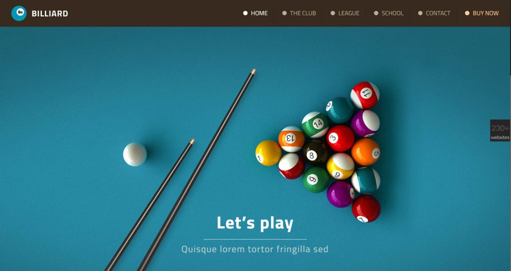
Billiard is a minimalistic theme, designed to show its readers the real purpose of the website and what they will find there. It shows its identity in the combination of colors and images, all showing the real product that the website is trying to promote: A billiard business!
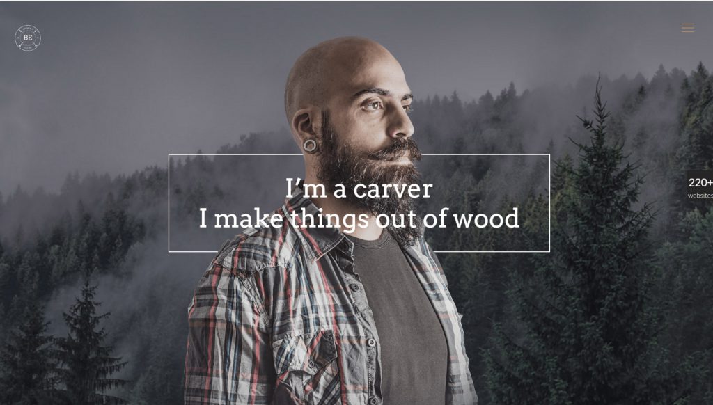
A wonderful minimal theme that looks like it’s made of wood. What does this show? The main purpose of why this website has been created. It is perfectly shown by a great combination of the promoted product (wood products), the main headline, the colors used on the website, the design, etc.
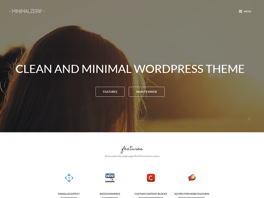
A theme that best shows your entire company’s profile, from the image used in the header, to the products at the loop, your team and your contact info in just a quick mouse scroll.
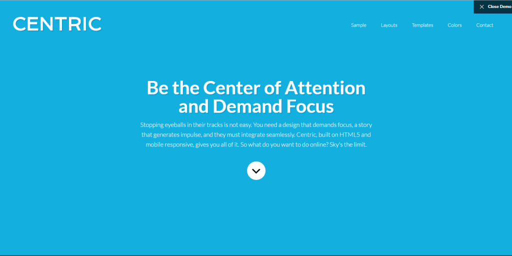
A minimal theme through which you can show the main purpose, mission, statement of your company in the header. The message will be very clear to your readers.
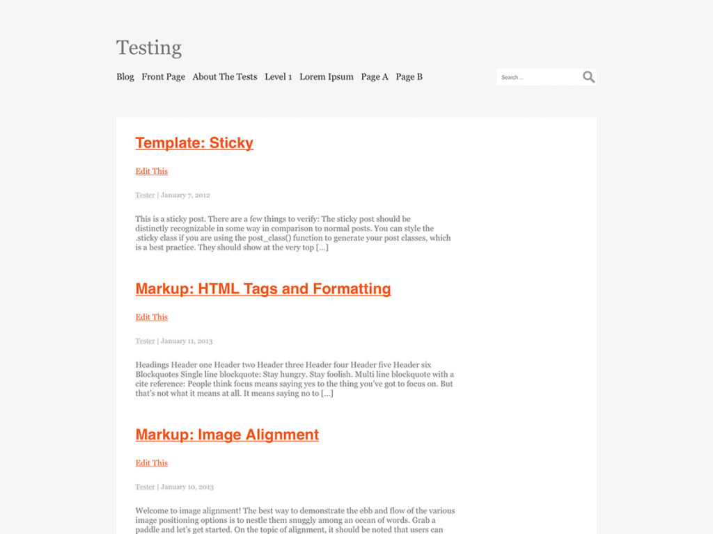
Minimal blog for bloggers who try to sell through articles, in a clear layout without images, colors, and other extra features.
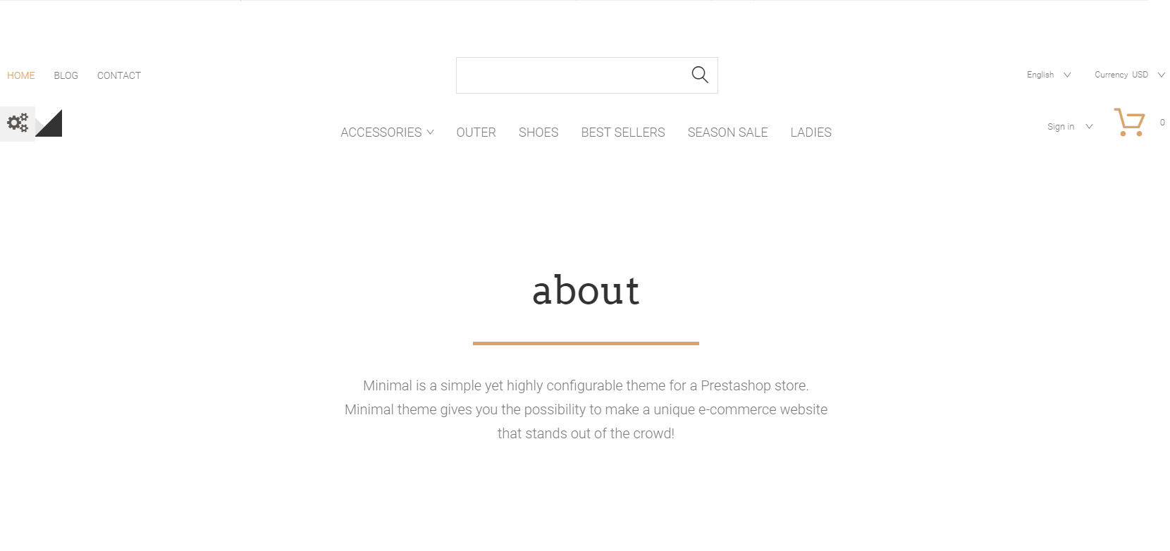
Did you ever think you would sell your products from a minimal-style website? It seems impossible for many reasons, but you can really do that through a Minimal theme.
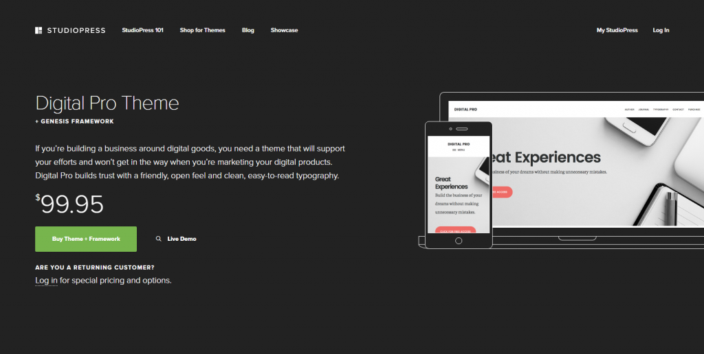
A theme for your mobile phone business / store.
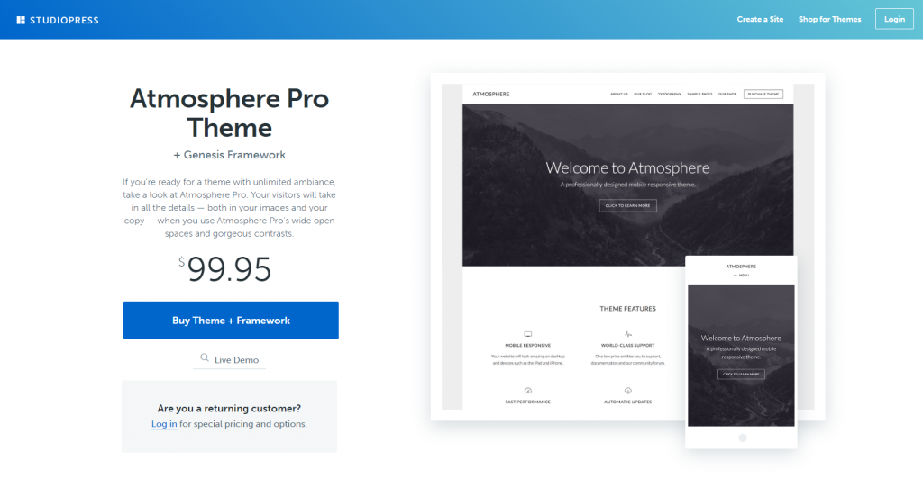
The perfect theme for your travel company. Show your clients a new destination every day (through the header image)… they will be tempted to visit the place with your help.



Comment
Discuss about this article below